Project Overview
Goodcheck is a regexp based linter. It's great for helping teams automatically share information about their code base. Sider wanted to get more development teams using Goodcheck.
Deliverables
Documentation website
Rolls
design, layout, web developer
Design Solution
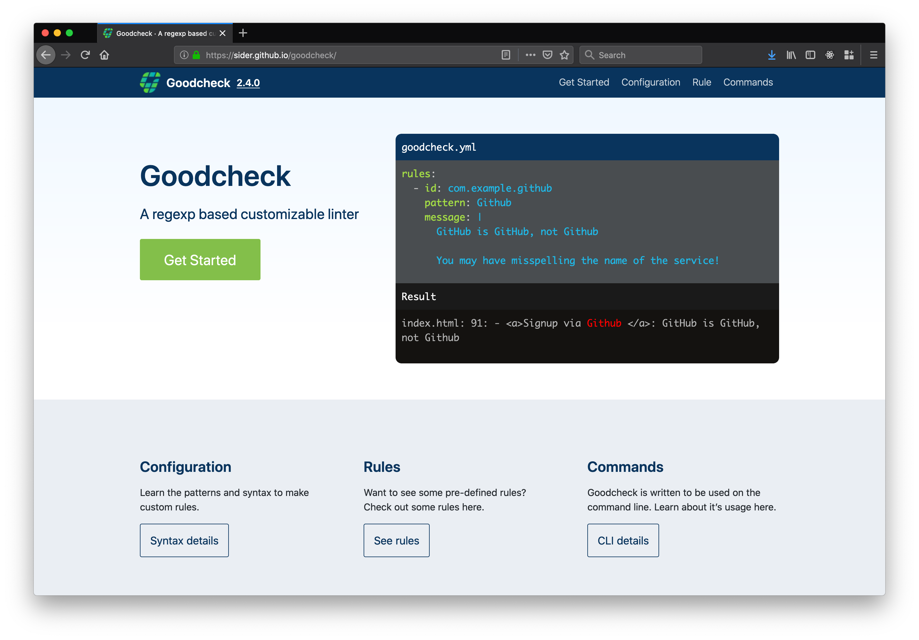
I was asked to create a documentation website that was easy for developers to look through and refer to for information. The website would help developers unfamiliar with Goodcheck get a better understand of it's abilities. I decided to feature code samples and explainations which would appeal to developers.
- Emphasis on code samples.
- Categorize information.
- Developers could reuse sample code for their own projects.
Research Method
Field research: Searching repositories for the use of goodcheck.yml.
Surveys: Surveys were sent out to 100 users of Sider to get a better understanding of their current use and understanding of the software as well as features they would like to see.
Pain point: Users don’t understand how to use Goodcheck or when to use it.
Interviews: The CTO conducted seminars and asked participants what they thought of the software.
Competitive Analysis: What other competing projects are out there, and how did they gain traction? This involved looking over similar linting tools. Finding their origins and what methods they use to gain more users.
Projects such as ESLint gained traction by open sourcing their project and having community members contribute to the project. This also involved doing seminars at various relevant events. They had a website and tutorial videos with examples of how to use it. After installation users could also start with a recommended list or manually create their own.
Breaking this down, I looked at what is possible for our situation. Although Sider ran seminars, getting outside of Tokyo wasn’t so simple. The obvious ones that could help users was a website, tutorial videos and creating articles.
Synthesis
After conducting the survey and hearing feedback from conferences participants, it was apparent that developers thought that the software would be useful, but there was no specific use cases they could think of to apply to their own work. Creating a website to clearly show the way it works and how it it could be used would help developers get a better idea for their own projects.
Website Features
- Clear display of code a results.
- Easy navigation
- Examples of Code and use cases
Personas

John
He works for a 20 person web development company. Some of the company's projects have demanded more people than were available and the company has outsourced some of the development. John has had to integrate the outside developers into his day-to-day workflow.

Satoshi
CTO of a small startup. Has about 4 developers on staff. Employs interns but often finds himself explaining the same issues during code review.

Delaney
Software Development Director. Responsible for meeting with the product management team to discuss and schedule features. Has difficultly with developers getting thorough code reviews in a reasonable timeframe, while still making progress on their own assignments.
Ideation
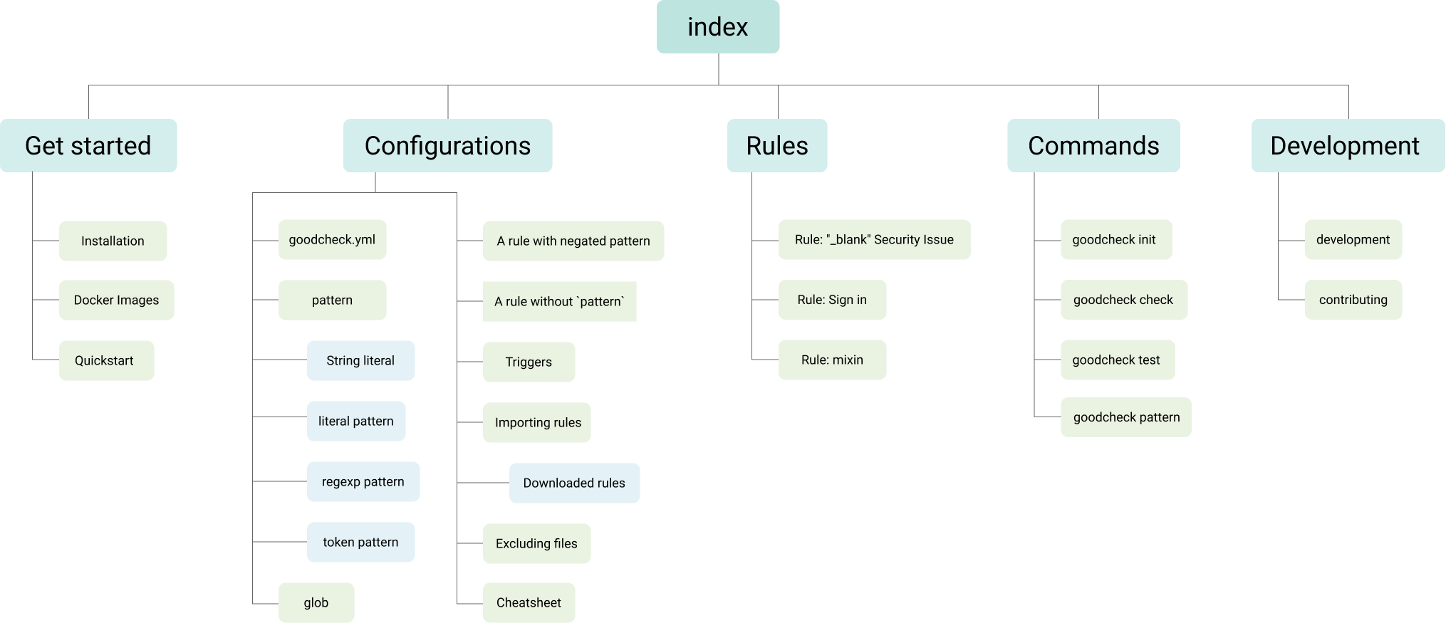
Information Architecture
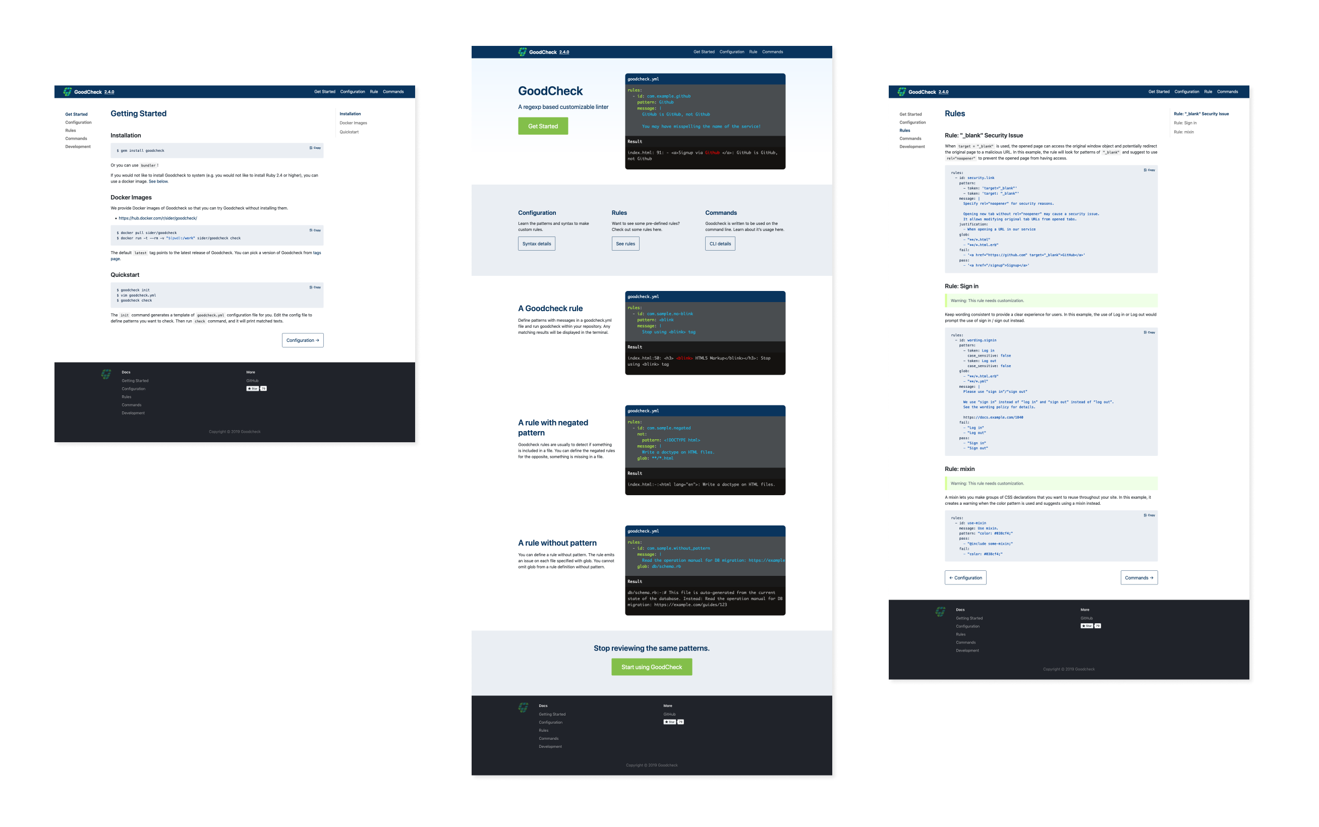
The GitHub repository for Goodcheck already had the information in the read me, but was all on one page making it difficult to sort through. Breaking them down into the various sections would make it easier to access.
Wireframe
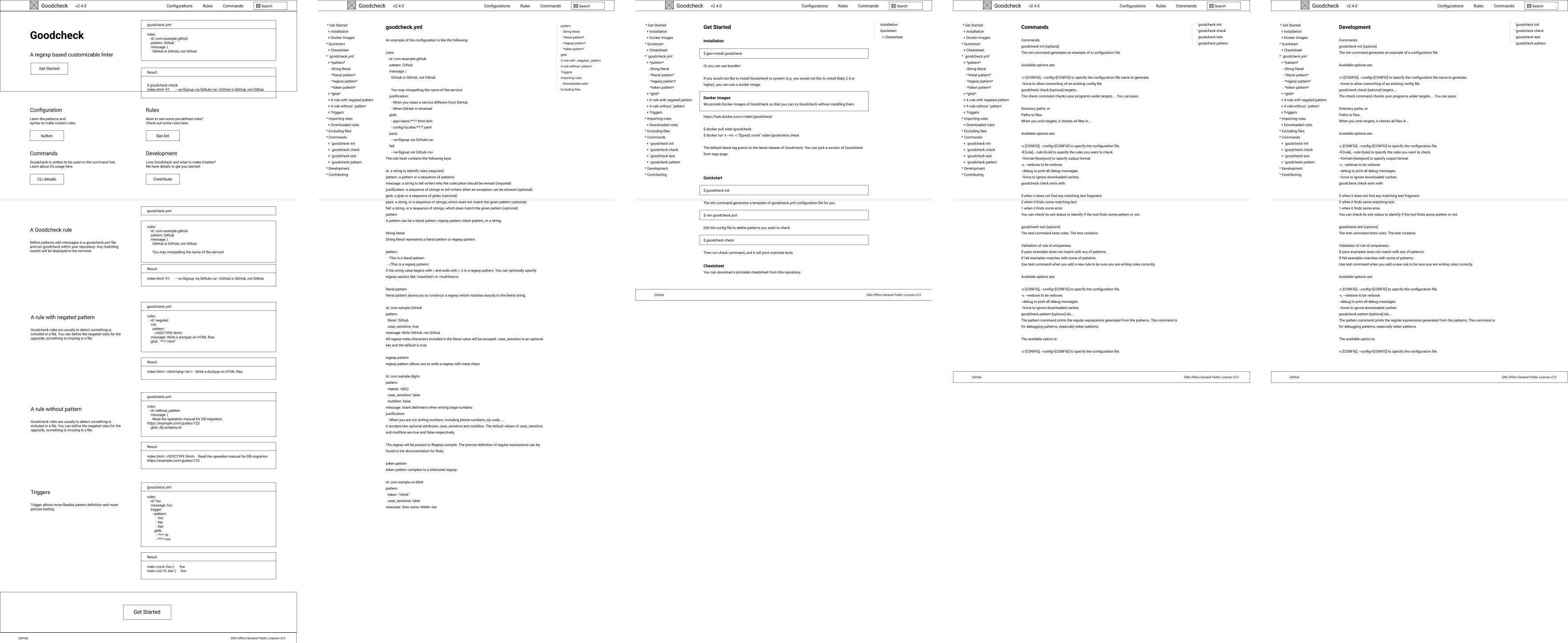
Wireframes were made to decide which layout would work best for developers. After discussing with the CTO, featuring the code and results would be the most appealing to developers. The other pages would use the layout from docusaurus to make it familiar for developers and easy to update.
Feedback
After going through the wireframes with the CTO, we narrowed down the amount of code examples on the main page. We also decided to limit the links on the left side bar to only the main sections with links to the anchors on the right.
Design

- Colors for the website were chosen to complement the logo and present the tool as professional, but friendly.
- The color green is used for the CTA and used to be more inviting.
- Different tones of greys are used to mimic the look of IDEs and console window.
- Bright blue is used sparingly to draw attention to the code.
- Light blue is used to create some contrast between sections and code snippets.
Reflection
What did I learn?
- The trickiest part of the design was getting the code to format correctly because I was creating it with ReactJS. Customizing it with a syntax highlighter such as Prism would make the process easier.
What would I do differently next time?
- If I had more time I'd get more feedback from developers on the website itself.
- Install inspectlet to see user sessions and get a better understand of how the website is being viewed and iterate from there.